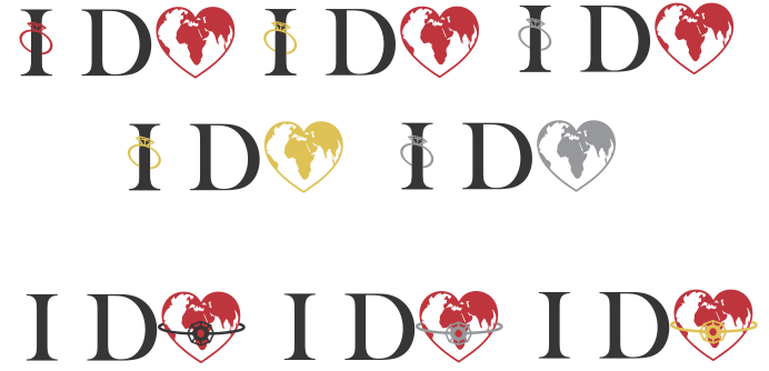
Logo Revamp for I Do Destinations, a travel agency specializing in romantic getaways- honeymoons, anniversaries, weddings, etc.
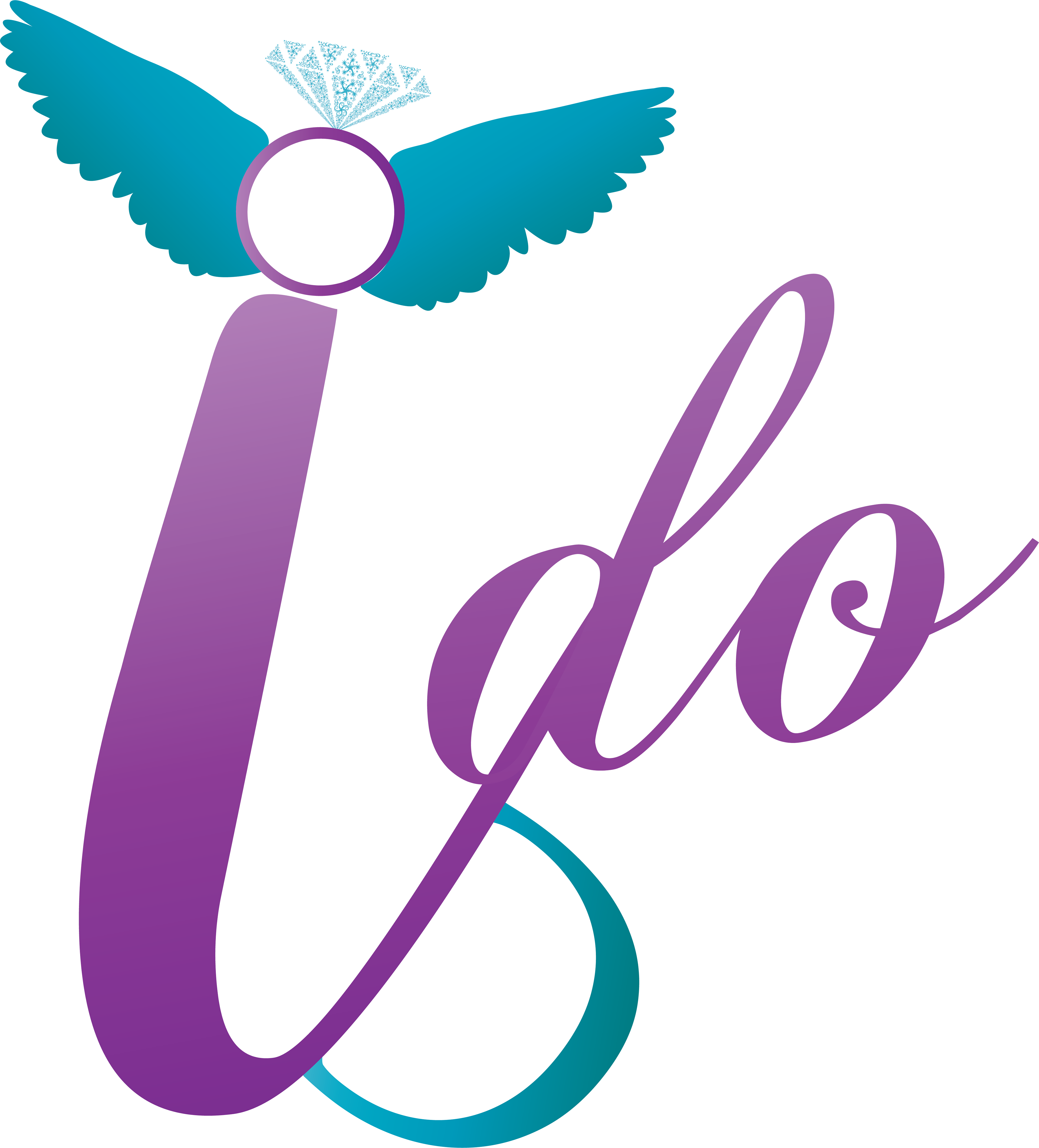
Above is the previous logo the client had before coming to me. The colors did not reflect her brand; she needed something more elegant to cater to more luxury clientele. Additionally, gradients can be tough to work with, especially on printed materials. We decided to keep some pieces of the original branding when creating the new logo, such as the ring and font combinations.
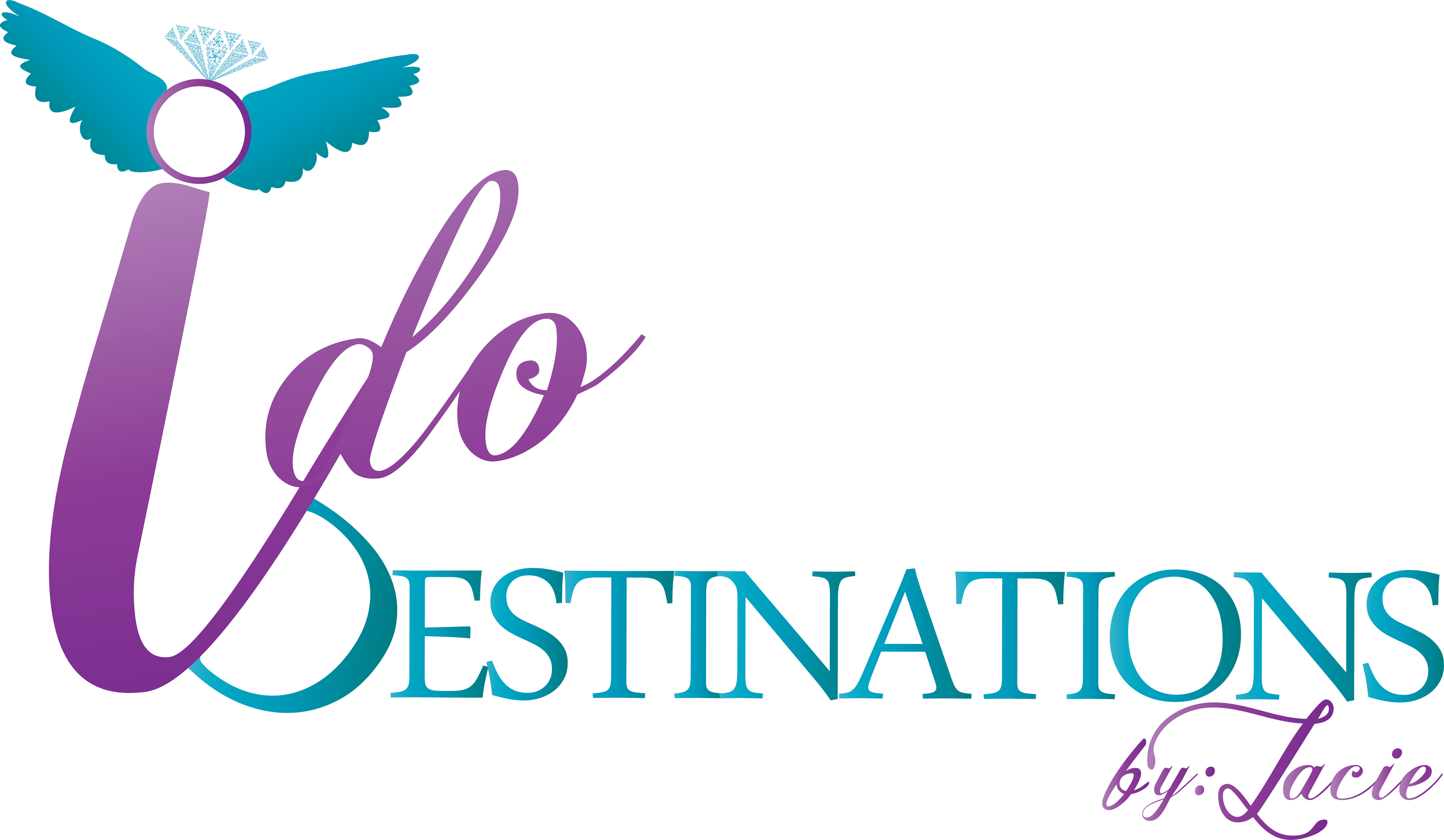
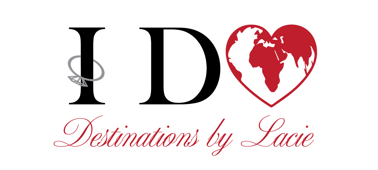
In the revamped logo below, the colors are simplified, the fonts work together, and it accurately represents the new clients she wishes to attract.
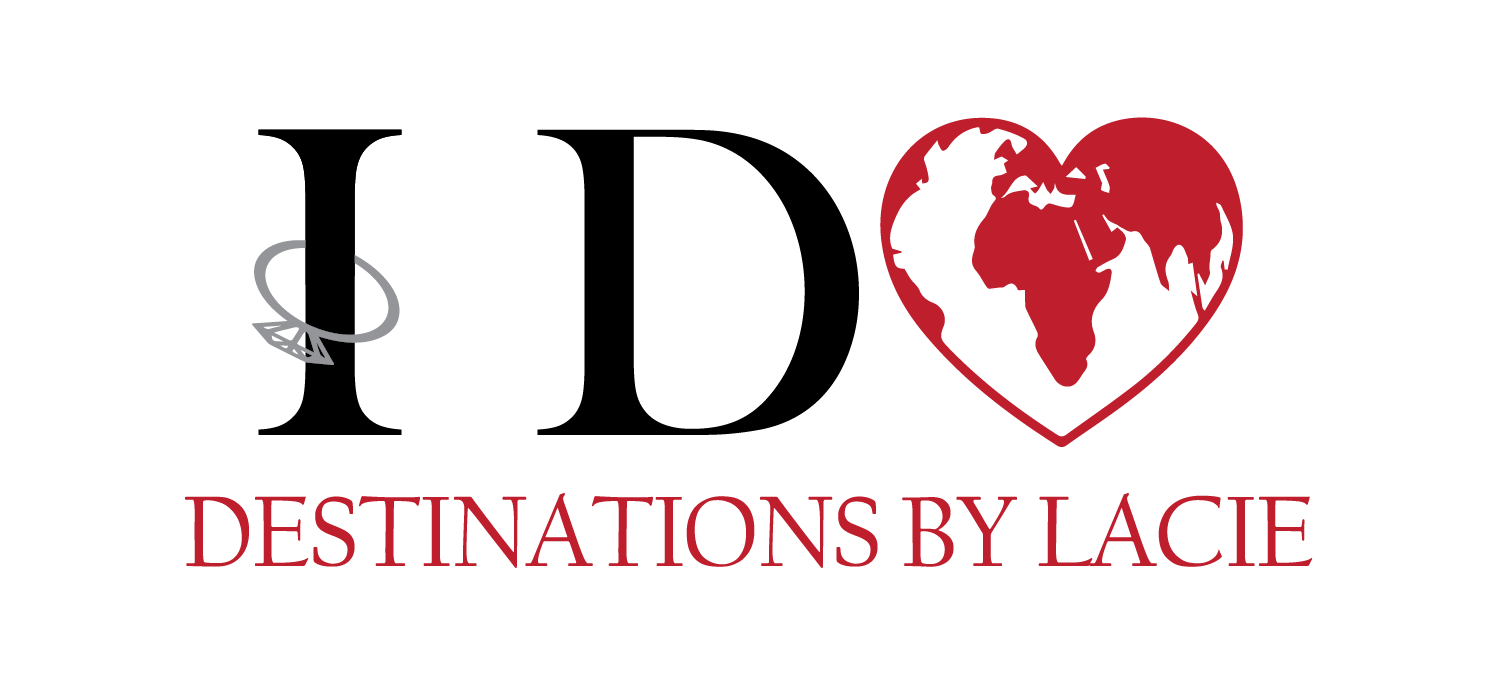
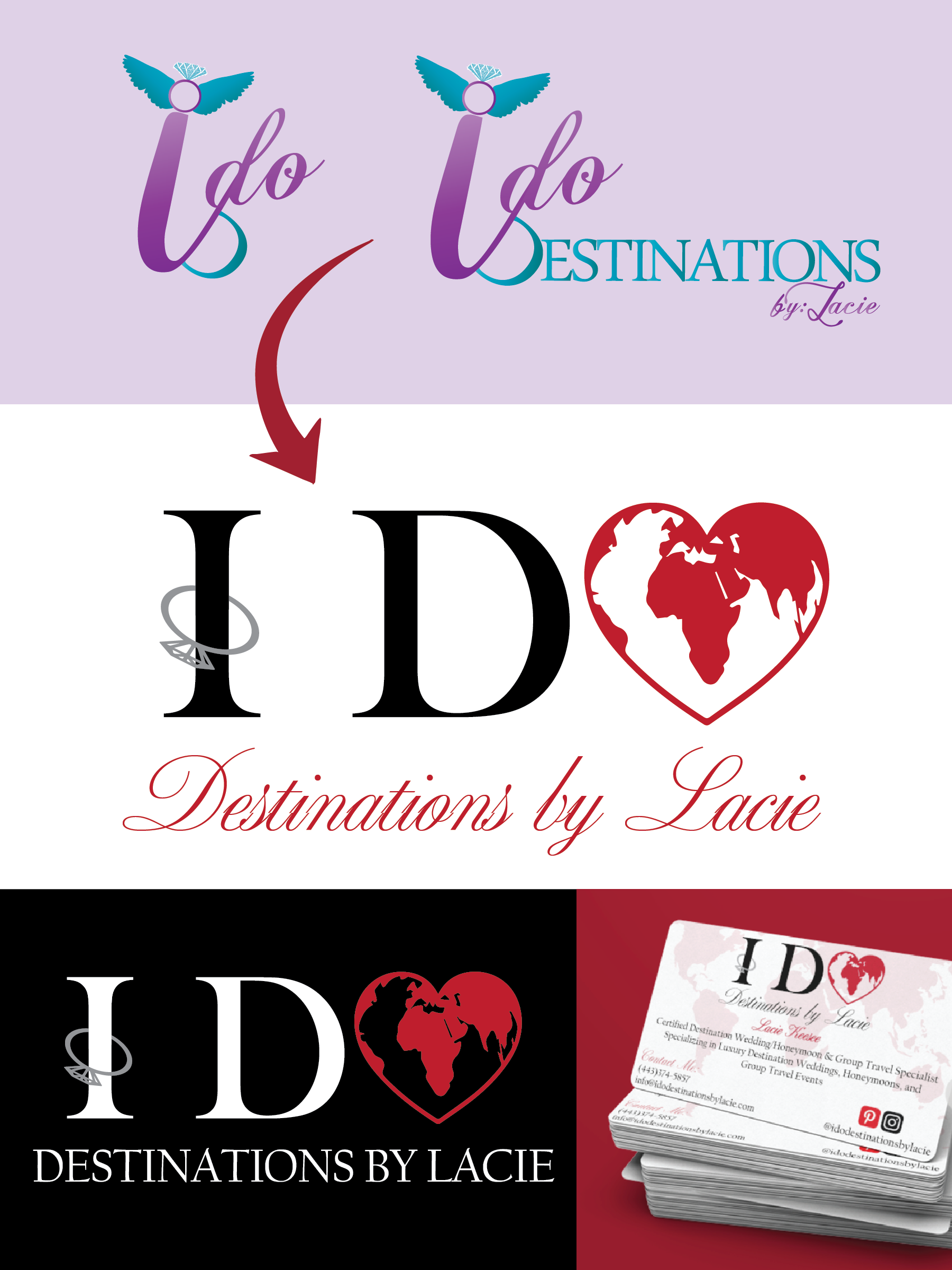
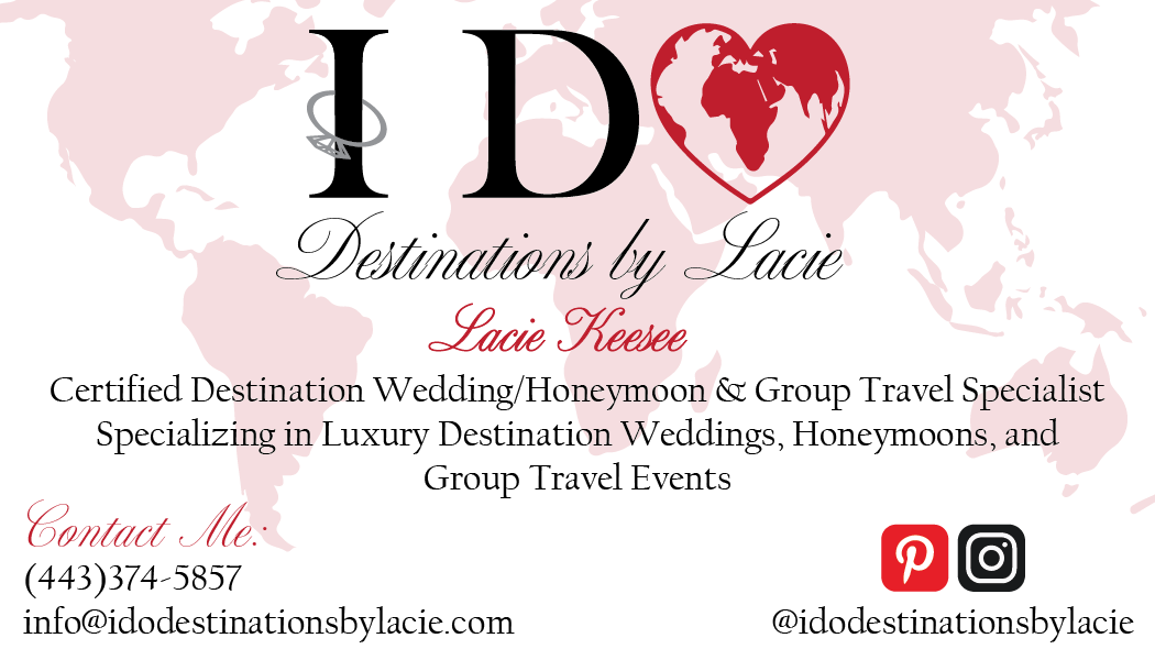
Complete with new business cards and branding, I consider this a successful revamp!
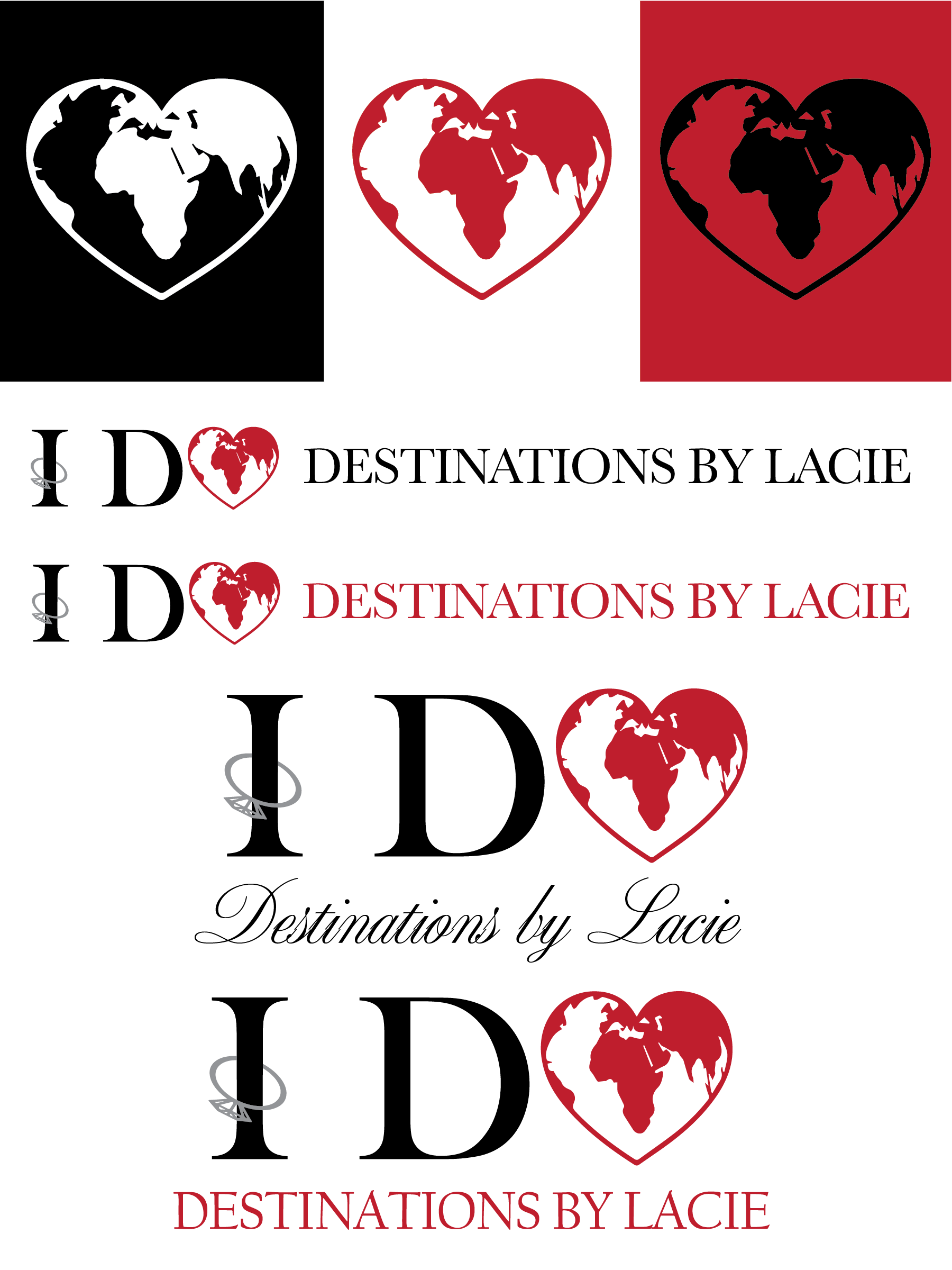
Other rejected concepts:
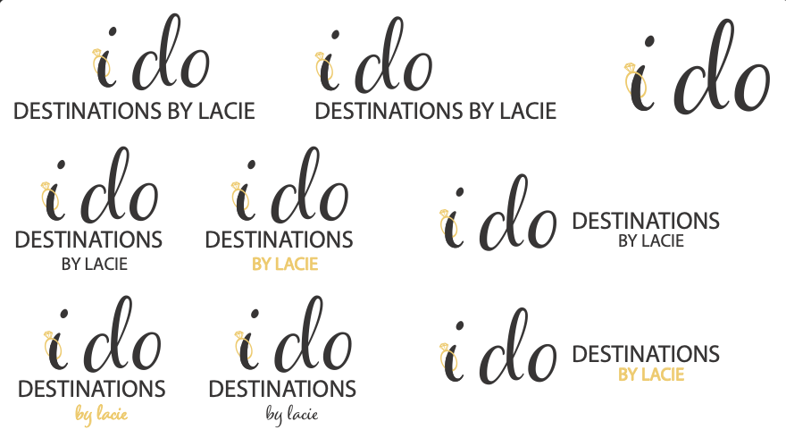
Trying out gold, decided on silver
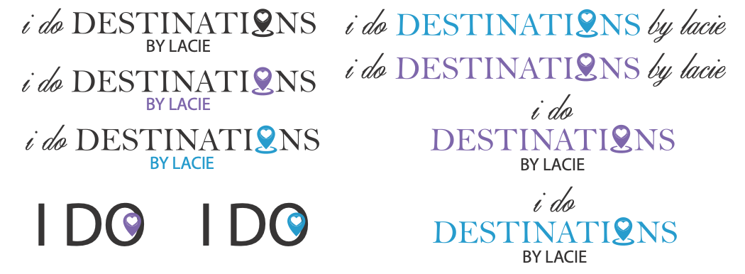
Kept the original color scheme and played on the destination piece